GlobalExam
A brand refresh, from the logo up.
A brand refresh, from the logo up.
The brief
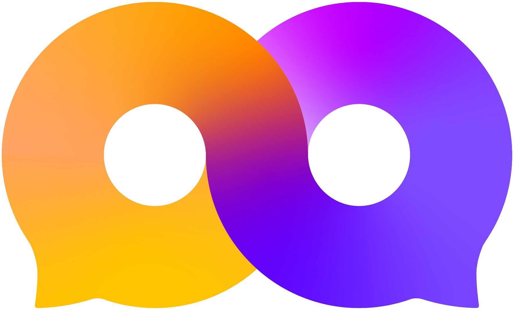
Languages create *links* between people and cultures. Before leaving GlobalExam, I redrew its identity around that idea: two speech bubbles joined into one *infinite* conversation.
Keep scrollingBeforeThe logo

 Keep scrolling1 / 4
Languages bind people together, and the brand promises to stay by its learners all their life long.
Languages are the core of the business. In a globalized world, they are what makes people talk.
Orange for vitality, violet for performance. The gradient modernizes the mark and runs through the whole charter.
A black wordmark keeps the logo timeless. It ships in four versions, one per background.
Hello
Bonjour
Hola
Hallo
Ciao
Olá
你好
 On whiteOn black
 On violet
 All white on B2B and CPF blue
Motion
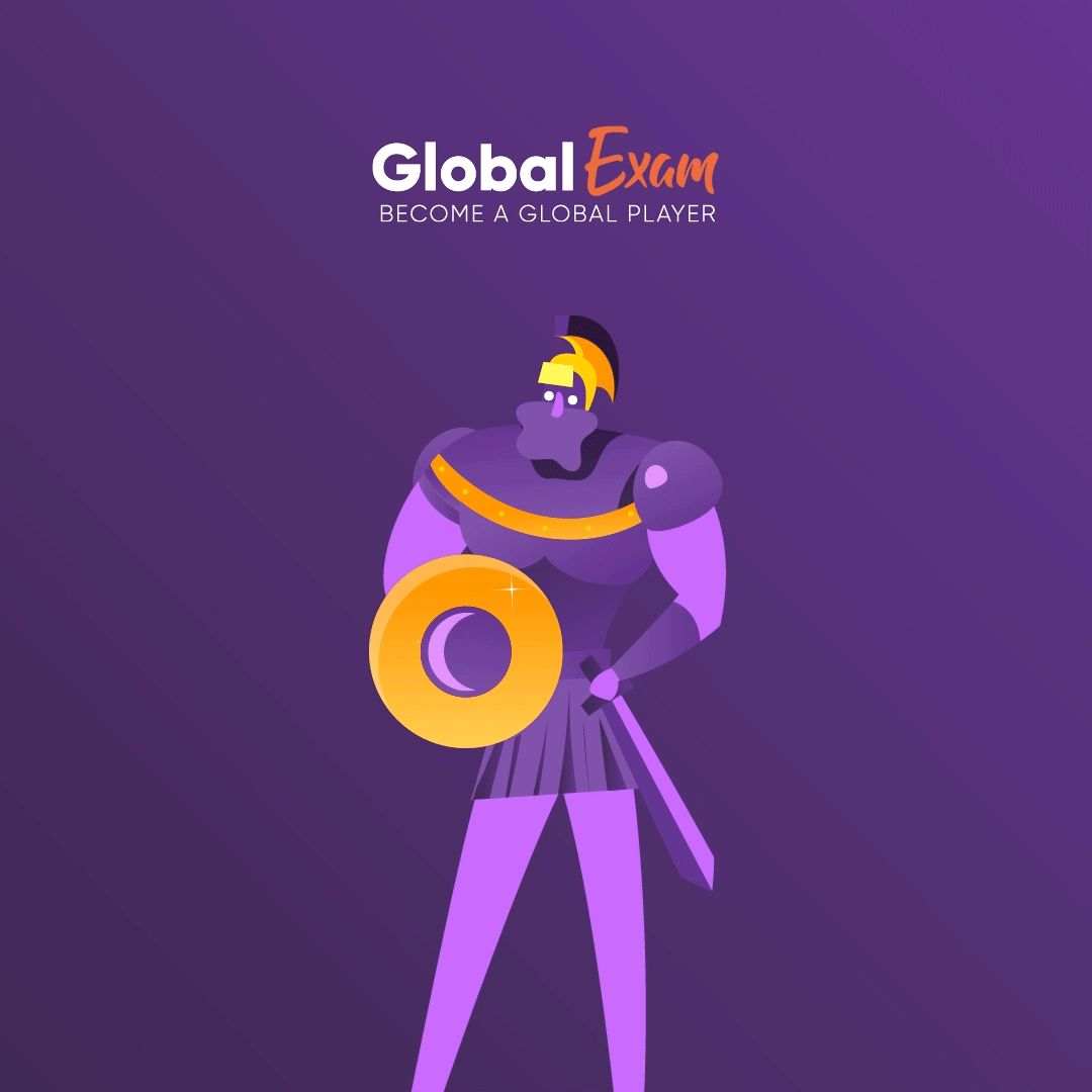
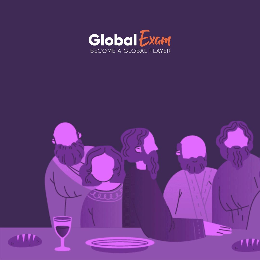
A charter rule: viewers decide in three seconds, so every film starts with the mark. Here is the brand in motion, built only from its own pieces.
Graphic element
Colors and typography








Iconography
White objects with a touch of brand color for B2B, softer and warmer ones for B2C. They support the message and never take it over.
In use
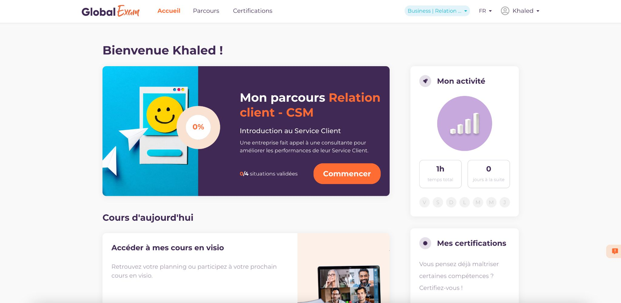
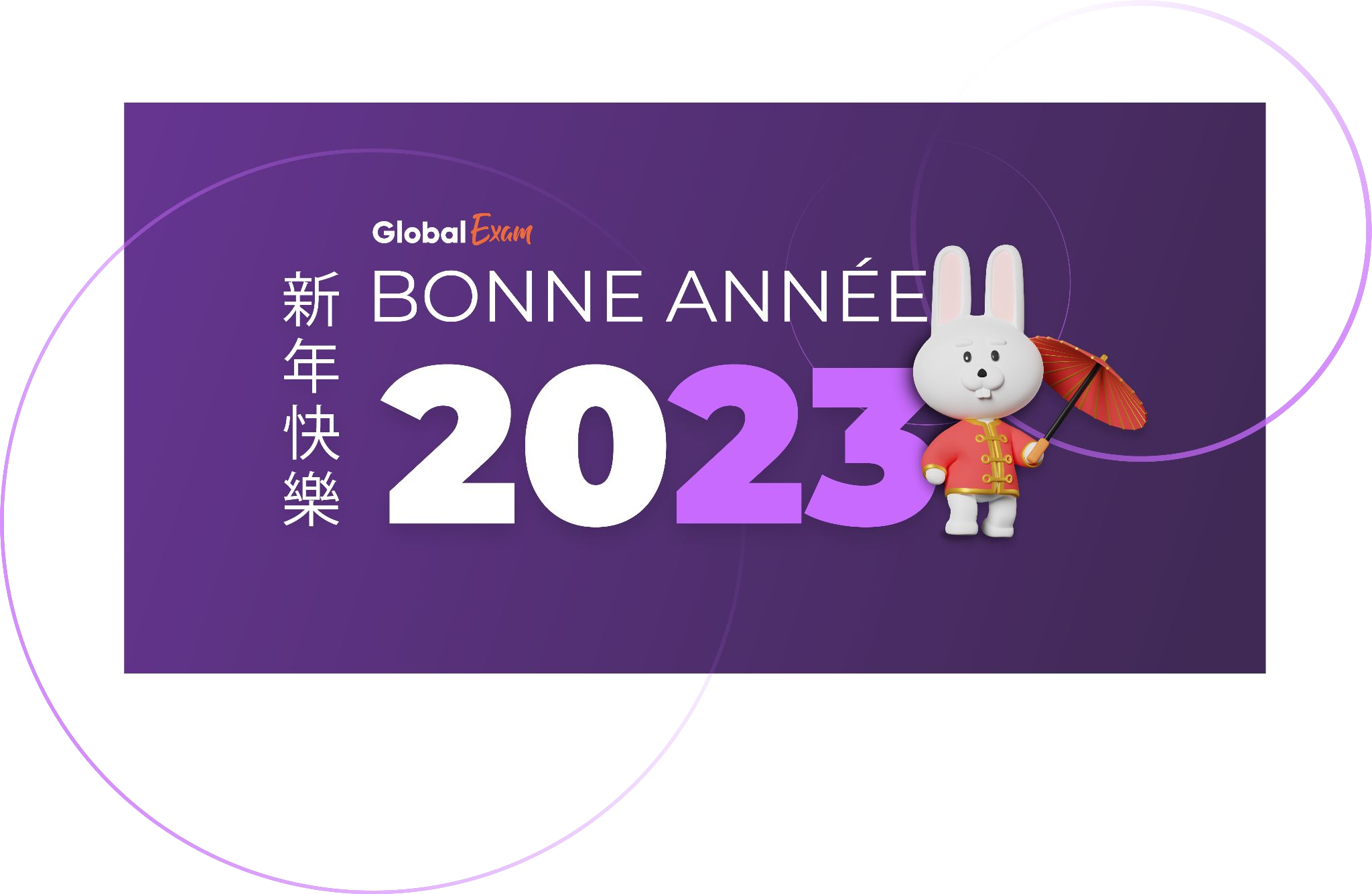
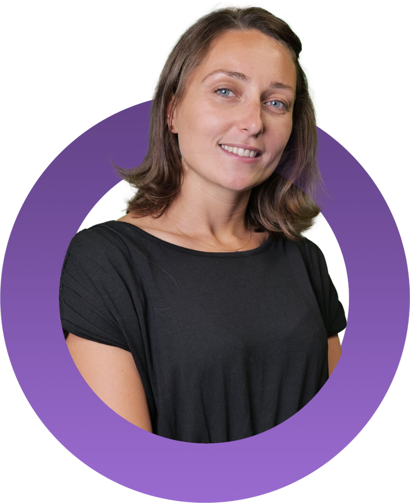
Keep scrolling1 / 6The platform, the seasonal campaigns, the people behind the brand and the motion illustrations, all drawn from the same toolkit.

Next project
GlobalExam × CPF